Tuesday, October 18, 2011

Modern Architecture

So, I was asked to rant about "form follows function" on the comments on Bad Catholic, a superlative blog that I follow, and I did. Apologies to everyone who had to scroll past my unexpectedly long post. I wanted to include pictures, so I will write about it here, mostly from cutting and pasting my comment and embellishing it. It is, after all, in my time period of choice.

Form follows function.

The phrase was coined by Louis Sullivan, considered the father of modern architecture. Before you judge the man too harshly, know that he didn't design what we consider "modern" architecture, but rather, a new type of building based on the ability of steel beams to soar, with exterior decorations added to emphasize height, and the function of the building, rather than following the old style of stone courses for each story from when the bricks actually did the work of holding up the building.

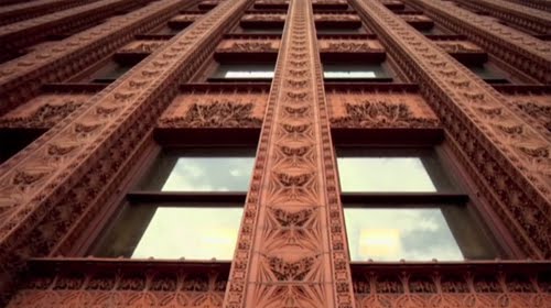
He was quite the rebel in 1890s Chicago, and the most (in)famous student of his style is Frank Lloyd Wright. Despite his abrasive personality, he made some gorgeous buildings, far more ornately decorated than the traditional buildings he moved away from. It really looked like art deco and art nouveau, only forty years early. All the decorations framed functional aspects - receding arches and solar patterns around doors, marble everything on banks, vertical courses of stone zooming up between the windows of skyscrapers. My favorite thing he did was take classical elements, like a doric column, and used its form and proportions on the entire building, with a sturdy base, "fluted" sides, and a course of decorative stone on top.

Observe the vertical lines of this building, and the column design.


In this detail, you can really see the way the surface looks like a steel skyscraper frame, only carved. The lines draw the eyes upward.


And capping off the building, look at this cornice!


One of his most famous buildings was the Transportation Building at the 1893 Chicago World's Fair. He refused to follow the beaux arts style that the architects agreed upon, and designed what basically looks like an art deco train station. Apparently it was painted with reds and golds radiating out from the arch - it must have been glorious.


Not that beaux arts isn't awesome as well. In fact, it is one of my favorite styles. An example of beaux arts construction from the fair was the Fine Arts Building, which happens to be the only building still standing today (in order to get insurance for all the art, they had to build a real building, not a temporary facade). It is now the Chicago Museum of Science and Industry, and words cannot express how much I want to go there! Note the classical proportions and features. Truly beautiful.


Speaking of which, beaux arts also has its skyscrapers. The Flatiron Building in NYC is a nice example. It looks like a blade of awesome thrust into the city. Note how the courses of stonework run horizontally under the windows. That is just a facade of stone, not part of the floor, but it is a holdover from Renaissance architecture. Sullivan thought leaving it on there stopped the eye in its upward journey, so he changed his stonework to vertical. Again, a facade, but one that follows the building's skeleton, and makes the skyscraper look taller. I like them both, but this clearly illustrates "form follows function".


Sullivan was very into using the Golden Ratio and form, unity, harmony (both within the design and with its surroundings), and decoration - all that stuff that architects forgot soon after that...

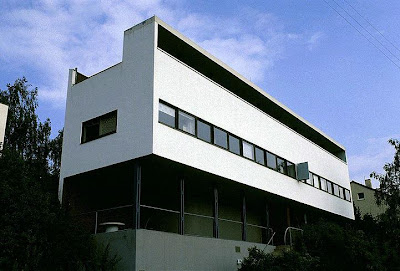
Enter communism. The internationalist movements of the late 19th and early 20th centuries were trying to find a style of architecture with no national flavor. Many of Sullivan's students and adherents were into that too, so they started stripping off aesthetic elements to achieve some kind of stylistic unity. This nonsense reached its peak in the 1930-60s, with old buildings being demolished and replaced by monolithic cement and glass skyscrapers. They believed that form was secondary to function, that once you got a building to do what a building does (hold furniture and people, keep out the weather) you can stop, no matter how it looks. Decorating it was aspirational and terribly bourgeois. Some of them went so far as to leave all the "functional" elements, like ductwork, exposed, claiming that as an aesthetic. The really ironic thing is that exposed ductwork is hard to keep clean, huge glass walls bleed heat and rack up huge heating and cooling bills, and flat roofs leak. These buildings are not functional at all - their very banality actually hinders their function. So much for integrity. By any measure of beauty, these modern buildings failed, because the ideal behind them was to erase humanity, not to uplift it.

In this one, you can see how it resembles Sullivan skyscraper, only plain. It actually looks older, because it has the reek of dingy bureaucracy about it.


For a more egregious example, check this out:


Need that flavor out of your mouth? Here's an image search of Sullivan's work. And here's some beaux arts. And what the hey - a little art nouveau and art deco. Enjoy

Sunday, September 25, 2011

Jodhpurs: the Official Trousers of Adventure!

Part One (There will probably be a part two....)


........................................................................................(It's me!)

I love jodhpurs. I have two pairs from eBay, and they are smashing! I do have one thing to point out for anyone selling a pair of these stupendous pants though - measurements. The waist and inseam measurements are obviously important, but they always list the hip measurement (not a problem in jodhpurs) and not the calf measurement (a huge problem). I realize men my height in the first World War and the 1920s (the eras in which my jodhpurs were made) had much thinner calves than me (I have cankles, which is quite annoying) but it would be nice to know if there is enough extra cloth to move the buttons or sew in an extra panel to actually get them closed. Just a tip. Anyway, I love them. They are more comfortable than they look, and I feel amazing all day when I wear them.

Not only do they look cool, and show off a buxom figure, as pointed out by River Song, but they are the official trousers of adventure. It's true. All adventurous activities used to be done in jodhpurs - riding, fighting, flying... not underwater exploring, but pretty much everything else. And one does look extra adventurous in them, even just standing around:

Raoul Lufbery looking quite dashing,


Amelia Earhart looking snazzy as well,


Frank Luke, not looking too happy, because his wingman was killed during that battle, but the wreckage of the balloon behind him is pretty impressive.


Charles Lindbergh, with the Spirit of Saint Louis...


...and working on the engine.

Now, it may be that the adventurousness of these people has more to do with the planes behind them than with their attire, but what about when your adventure goes slightly awry?


Or lions try to nom you?

(ok, so those lions are his pets, but I think that makes Lufbery even more adventurous!)

And, if you needed more proof, here you go:


In part 2, I will demonstrate the fact that any activity, if done wearing jodhpurs, becomes more adventurous. But it will be a while, so back to the randomness for a few posts...

Tuesday, September 20, 2011

My Other Blog

So, I've started another blog. I have a bunch of random thoughts floating around in my head, and many of them are not about steampunk, and this is a steampunk blog. So here is my other blog. I will be writing about hipsters soon. That should be fun.

Up next on this blog: Jodhpurs, the official trousers of adventure! Part one..... (finally)

Sunday, August 14, 2011

Wikipedia is dead to me.....

....and it's quite sad (and probably temporary - what can I say? I'm an addict). I was trying to look up various hats in order to comment on my brother's blog post. I needed to make sure that my instinct about the appropriate hat to wear with tweeds in the country was correct. I thought it was probably a fedora or a trilby but I wasn't sure if a homburg was actually the one I meant (but homburgs are more formal - like a banker or prime minister might wear). This may not seem very important, but there is always the possibility that some chappish troll might challenge my choice of lid, and an ugly incident like this might occur (ridiculous argument in those comments - akubra my foot. It's obviously a fedora).

Anyway, where does wikipedia come into this story? Well, naturally I looked there first. I searched men's hats, as I have done many times in the past, and eventually came to this "list of headgear". Well, it was a start. I found the hats I wanted, read the pitifully short articles, and then found the answers I needed on artofmanliness.com.

The problem is this: Look at the headings for the list of hats. It starts out by showing all the kinds of hats that aren't worn anymore, then a bit of a list of hats, then more hats that aren't worn anymore (which is a trend that needs to stop). Then it goes into specialty hats. But this is not how wikipedia used to handle hats. Before they had, in almost every entry on men's hats, a discussion of how formal they were, giving good, meaningful comparisons across class, era, setting, and time of day. It was very helpful to know that a homburg is between a top hat and a fedora, but top hats are rarely worn during the day except at weddings and Ascot (morning dress occasions). It was helpful to me to know Morning Dress is the equivalent of White Tie, and Stroller is the equivalaent of Black Tie. But what if one is in the country? In the daytime? The evening? What would one go Bunburying off to a country manor in, while driving a Bentley and guzzling Grey Poupon? (It is awesome that it accepts "Bunburying" as a word without underlining it in red)

Wikipedia used to run down every possible combo. It was lovely, as a writer who likes dandyish characters, to be able to pinpoint the exact level of rakishness I needed. Now it's all dumbed down. Lame. The article for Stroller style still has a bit of what I was looking for.

Hmm. It occurs to me that a tweed flat cap might not be amiss...... What would the 11th Doctor wear? No, never mind - that would be a fez.

Friday, July 22, 2011

The Coming Thing! (I want it)

So, the new version of the Mac OS X came out recently. It's called Lion. I read this nineteen page review of it, and I totally want it! Now! Unfortunately, I would need to install the previous OS X, Snow Leopard, in order to install Lion, because of some kind of magic regarding how it partitions some disk space for itself. Oh, I wish I had money, then I would just get a fancy new Mac that already had Lion.....

At first I was a bit distressed to see that they'd really flattened the look of all the buttons and widgets and icons and things, because I liked the candy-coated look of the OS X. But when they got to the part about the scroll bars, I began to think it was really beautiful and clean, like the more recent versions of iTunes. On the whole, I like Apple's design philosophy, and I like that this is more on the sleek side, rather than the cutesy side. The only caveat I have is, they got rid of the clicky arrows for the scroll bars - I hate having to move the mouse if I don't want to, although you can still use the arrow keys of course. However, I think this is more than made up for by the fact that you can resize windows from any edge! Not just the bottom right corner.

It has autosave on everything (everything native, that is, you still have to hit apple-S for most third-party programs). Now, ordinarily, I turn autosave off, because half the time I make changes I'm not sure about, and only save them if I'm sure. I get really paranoid about saving over the good version of things. But Lion makes a previous version every time it saves, so you can go back and recover stuff in a neat new application. It also saves your last window arrangement from the last time you were using it. That is cool. I'm looking at you, Final Cut Pro....

The second half of the review is about technical stuff. I only understood part of it, and it took me a couple nights to get through, but it's pretty amazing how smart they made it. The way it uses memory, the way it allows applications to talk to each other, and the way it lets you customize different screens are all quite cool. As I was reading it, it totally seemed like Tron.

Also, at first it seemed like they were getting it a little too dumbed-down for new users, but the fact that it is actually more customizable than previous Macs, and has much more powerful tools, is awesome. I think it's important for computers to be intuitive enough not to intimidate new (usually old) users, but offer enough depth to get them to do all the stuff you need without jumping through hoops and wasting time.

Yep, if I ever get a real job, the first thing I will buy, even before a new tattoo, will be a sweet new Mac....I can dream can't I?

Saturday, June 25, 2011

Whooooo HOOOOOOOOOO!!!!!!!

So JK Rowling is finally - FINALLY! - releasing all the Harry Potter books as ebooks. She was one of the most vocal opponents of digital publishing, because it's cool if wizard books have changing pages and pictures, but it's not cool if muggles get ideas above their station. It would be lovely to be a wizard and have all your stuff look like it's the 19th century but magically have all the advantages of the 21st century, but some of us embrace technology (and then steampunk it so it looks like the 19th century). Ahem. Anyway, this is awesome, and it will make my customers very very happy in NOOKland.

Now for a touch of irony. Those of you hang on my every post will recall that I said Amazon's insistence on a proprietary format for the Kindle was not at all the Coming Thing. Well now they've met with a dose of their own medicine, since Rowling is releasing the books solely through a website of her own called Pottermore, which will apparently offer content beyond just downloading the books. Here's the kicker - it may just have them available as epub. I'm chuckling. My guess is that she may give in and offer Amazon's ridiculous format, but I hope not. It's about time Amazon got into the real ereader market. If they think they can't make a profit selling hardware and using convenience to incentivize customers to shop their ebook store, then that's their tough luck. You don't see Barnes and Noble complaining about NOOK customers buying books through Google and Gutenberg. One of the NOOK's biggest selling points is the fact you can get ebooks from the library for free. That's the Coming Thing.

I just thought I'd share. Proprietary formats get my dander up. If you can't keep your customers by giving the best product and service, then you probably don't deserve them.

Sunday, June 19, 2011

Random Post Because This is Cool

So I just finished reading Seal Team Six. If you didn't think Navy SEALs were awesome before, well, you must not have been paying attention, but reading this book will get you up to speed. Anyway, as I was reading it, I looked up pictures of some of the weapons and aircraft in the book. Here is an awesome picture of an AC-130 gunship shooting flares and creating a giant eagle-looking cloud of smoke:

Thursday, June 16, 2011

A Coming Thing - the eReader!


So - eReaders. I think they are the coming thing, especially the Nook and sort of the iPad (not because it is a particularly good ereader, but because it can run ereader apps and also does a bajillion other things). I say "sort of" for the iPad because it's dead to me. When Mac comes out with a computer where I can draw on the screen in Photoshop and dump my drawings into Final Cut to animate them, then we'll talk.

Anyway, ereaders: In the interest of full disclosure, I work at Barnes and Noble, but even if I didn't I would think the Nook is better than the other readers, including Kindle. Sadly, Kindle is the next best one, but it's miles behind the Nook. This post isn't really about consumer information, but just a quick note - the Kindle uses a proprietary format so you have to get your ebooks from Amazon, and that is not and will never be the coming thing (that's not to say it won't become more common in the future, but that is not what makes something the coming thing. I also don't think it will be more common - I've heard Amazon is going to cave and start allowing epub on the kindle). Nook is open-source and uses epub and pdfs, so you can get books from every site except Amazon, including libraries for free. That is the coming thing.

As much as I like the Nook Color, I really think the new Nook, with the e-ink touchscreen is the best. What I like about it is how it seems very simple, and in fact it is, but only because it's very high tech.

When the Kindle came out, followed closely by the Nook, e-ink was pretty new, with a really slow refresh rate, and a longish black flash when you turned the page. The cool thing is, during that black flash, magnets are pushing ink around into little grids, like an etch-a-sketch, basically. Now the refresh rate is much faster, and the screen looks crisper and more contrasty. The old Nook had an e-ink reading screen on top and a touch screen on the bottom, and weighed about two ounces more than the kindle, which only has a keypad on the bottom. The touchscreen allowed for menus to be rearranged and added via software updates so people can get much more use out of the same hardware. It's a little awkward, however, to perform tasks such as highlighting passages using two different screens.

Then the Nook Color came out. It's really fun! It has a full web browser, and it has apps (don't start playing Angry Birds or Flight Control - they're like crack. Actually Angry Birds reminds me a bit of Super Artillery, an Apple II game I loved in my childhood). It has better reading software and tools because the whole screen is touch. It also weighs a pound and has only eight hours of battery life, unless you kill the battery faster playing Angry Birds. Still, at $249, it's one of the best Andriod Tablet values on the market. If I had the money I might get one just for Epicurious.

But, really, if I had the money, I'd get the new Nook and be glad I waited. It's the most advanced, since it's an e-ink touchscreen. They stacked them on top of each other, yet it's thinner than both other Nooks and weighs just under 8 ounces. This is because the new e-ink parts are so small and the touchscreen is infrared, rather than detecting the electricity in the salts on your skin. It uses so little battery that you go up to 2 months without charging it, and it has a much more consistent sensitivity than the color LCD touch screen.

Ereading is the coming thing, especially for people who like old or unusual books, or are poor. It is not for everyone, like people who feel the need to snort the musty fragrance of paper books. My response to them - buy the ebook of stuff you kinda like, and save your money for the hardcover of books you will treasure. It's like people who only buy DVDs and refuse to rent them. It's weird. I think e-reading is awesome. For example, I like to write in books, especially since I read nonfiction for fun. Some books, like the Summa Theologica, are too big and printed too small to write in. A double spaced version would be prohibitively massive and expensive. There is a beautifully formatted eBook of it for 99¢, and you can put as many notes as you want, highlight it different colors, and send your notes to your email or facebook (or to your friends). It even adds the notes to the book's table of contents so you can find them easily. That's why it's awesome.

e-ink is also the coming thing. I'm very impressed how fast they got it to be in a touch screen, and I can't wait until they have color e-ink. I hear they are working on it, but I imagine the refresh rate on all the colors you'd have to mix would be very very slow. Also, the screen is opaque, so you could not stack black, magenta, yellow and cyan screens on top of each other, which is basically how printing is done, as well as real Technicolor film. I love how it looks though, and I think it is more futuristic than backlit screens. Anybody can imagine how an LCD screen is to read on, having at some point stared at a computer screen for hours (it's not very nice), but having changing ink is very cool and new. It also shows that the companies thought about how people like to read, and what they might enjoy. The best thing about e-ink is that it is very human, and very easy on the eyes. Ereading is a pleasure, and that makes me feels good about the future, which is precisely what "The Coming Thing" is all about.

Monday, June 6, 2011

It's D-day.

Here is President Reagan's speech at Point-du-Hoc.

Newfangledness Versus the Coming Thing

So I was thinking about newfangledness, mostly because I really like the word. I also think a lot of things are newfangled, but that is not always such a terrible thing. However, I don't think every departure from old ways and tech is newfangled. Sometimes it's the Coming Thing.

I think the difference is why the thing is new. If it is new just for the sake of having something new, I think it's newfangled. Sometimes I like it though, and I think newfangledness is somewhat subjective. Take Mountain Dew flavors. Every year they have a contest where you can vote on which of their new flavors they will keep, although most of these seem to be a flash in the pan. Some of them are very gross, but some are good, like "Game Fuel". All of them are newfangled. Things like dark chocolate KitKats and Reeses Cups are, I think, a worse kind of newfangled, because the normal variety used milk chocolate to go better with peanut butter. Dark chocolate actually makes these things worse. Consider why Mounds bars have dark chocolate and Almond Joy have milk chocolate. These classic candy bars were painstakingly designed, and the newfangled versions with some swapped ingredients just mess it up.

I think the Coming Thing is new because there was a need to fill, or a real chance of doing something either better, or perhaps for the first time. Automobiles, computers, and the like are good examples, but they make it seem like the difference is one of scale or importance. It's not. The Take 5 bar is a good example of a candy bar that was a new type, and was designed with ingredients that match and contrast perfectly. It could become a new classic.

Another way to think of it is like the 1920s, one of my favorite time periods. We think of the twenties as a free-for-all, full of crazy kids doing crazy things. Flagpole sitting, bobbed hair, the Charleston - all these things were fads, and were newfangled (but occasionally awesome). Also in that decade, however, with the increase in real wages and record low unemployment, middle class families could finally get their hands on refrigerators, radios, cars, phones, fans, and the electricity to run them. That was the coming thing, and it lasted.

Some things are both. I previously said that I think the 3DS is a coming thing, and I still think so, although they better get some good games soon. It's also a newfangled contraption though. There's not really a need for 3D games (although, done right it could be fantastic), but the technological development of a glasses-free 3D screen is amazing, and it will be used for more than toys.

Anyway, yeah, this was supposed to be an a post about eReaders, some of which are the coming thing.... but I got hungry.